
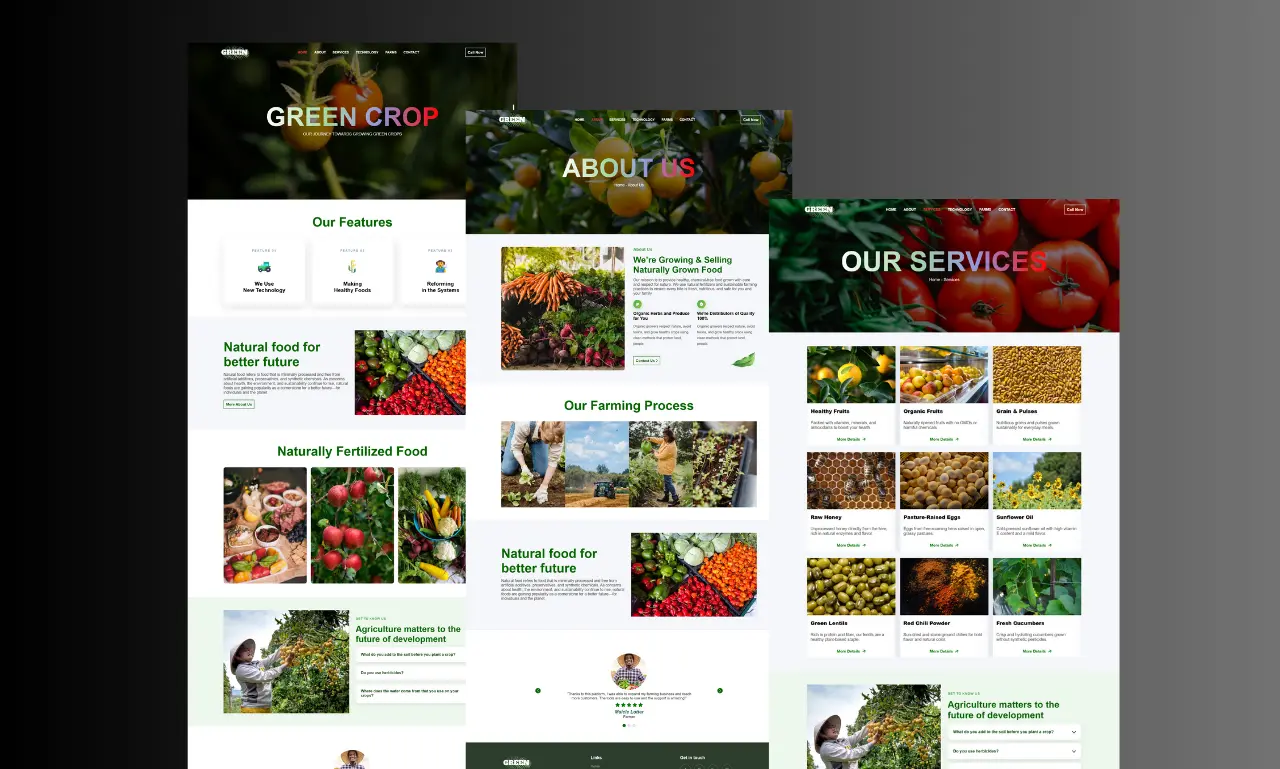
Responsive design that holds up on every screen, not just the preview.
Layouts built mobile-first with HTML, CSS and Bootstrap, then tested across real devices so your site never breaks on a smaller screen.
Designed for the smallest screen first, not last.
Over 60% of visitors will land on your website from a phone. Instead of designing for desktop and shrinking it down, I build every layout mobile-first, so spacing, navigation and text are readable on a small screen before anything else.
From there the layout scales up cleanly to tablets and desktops using Bootstrap's grid system and custom CSS breakpoints, so nothing overlaps, stretches oddly, or hides behind another element on any device.
What a responsive design project covers.
Responsiveness isn't a checkbox — it's tested layout by layout, breakpoint by breakpoint.
- Mobile-first layout planning for every page
- Custom breakpoints for phone, tablet and desktop
- Bootstrap grid system for consistent structure
- Touch-friendly navigation and buttons
- Readable typography at every screen size
- Image scaling without quality or speed loss
- Cross-device testing on real screen sizes
- Fixes for existing sites that break on mobile
Why hire me for responsive website design.
Mobile-First By Default
Every layout starts on a small screen, so mobile visitors get a properly designed experience, not an afterthought.
Bootstrap + Custom CSS
A reliable grid system combined with hand-written CSS for breakpoints that framework defaults don't cover.
SEO-Friendly Responsiveness
Google ranks mobile-friendly sites higher — responsive design is part of the SEO work, not separate from it.
Fixes For Existing Sites
If your current site already breaks on mobile, I can audit and rebuild the layout without starting from scratch.
How a responsive design project runs.
Screen audit
I review your current site or design on phone, tablet and desktop to find where it breaks or feels cramped.
Mobile-first layout
Each section is laid out for the smallest screen first, prioritizing what visitors actually need to see.
Scale up to desktop
The layout expands to tablet and desktop breakpoints using Bootstrap's grid and custom CSS.
Device testing
Every page is checked on real phone, tablet and desktop screen sizes before handover.
Responsive design questions clients ask.
It means the layout is designed and built for a small phone screen first, then expanded up to tablets and desktops — the opposite of designing for desktop and shrinking it down.
Yes. I can audit the existing layout, identify what's causing the issue and rebuild the affected sections to work properly across devices.
Both. Browser resize tools catch most issues early, but I also check final layouts on real phones and tablets before launch.
Yes, positively. Google prioritizes mobile-friendly websites in search results, so proper responsive design directly supports your SEO.
No, when done correctly. Responsive layouts use CSS and optimized images, which keeps load times fast rather than adding extra weight.
Want a website that works properly on every device?
Send over your current site or design and I'll tell you exactly what needs fixing.
Get a Free Quote