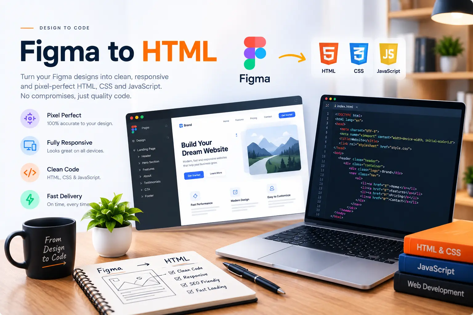
Design tools like Figma and Photoshop are great for showing exactly what a website should look like. But a design file is not a website — it's a static image with layers. Turning it into something that actually works in a browser, on every screen size, is a separate job. Here's what that process really involves.
Why "export to code" plugins usually aren't enough
Most design tools offer some kind of auto-export feature that spits out CSS or HTML. In practice, this code is usually bloated, uses absolute positioning that breaks on different screen sizes, and completely ignores how the layout should behave responsively. It looks right at exactly one screen width and falls apart everywhere else.
Step 1: Reading the design, not just copying it
Before writing any code, I go through the design to understand the actual structure — what's a reusable component, what's a one-off section, where spacing follows a consistent pattern. This becomes the blueprint for clean, semantic HTML rather than a pile of absolutely-positioned divs.
Step 2: Building mobile-first, not scaling down
A Figma file is usually designed at one fixed width — often a desktop size. Converting it properly means figuring out how every section should reflow on tablet and mobile, not just shrinking the desktop version until it technically fits.
A pixel-perfect design at one screen width means nothing if it breaks at every other width.
Step 3: Matching spacing, type and color exactly
This is where the "pixel-perfect" part comes in — pulling exact hex values, font sizes, weights and spacing straight from the design file so the final site matches what was approved, not an approximation of it.
Step 4: Adding the interactions the design implies
Static design files can't show hover states, animations or form behavior — those get built based on what makes sense for the design's style and the client's goals, then refined with feedback.
The result
A proper Figma or PSD to HTML conversion should be indistinguishable from the original design on every device, while also being genuinely fast, accessible and easy to maintain — not just a design that technically renders in a browser once.